Introduction
In this fifth blog post, I am going to discuss two areas of election forecasting: turnout and demographics.
Then, I am going to prepare a baseline model to predict the 2024 election. Over the next 4 weeks until the November 5th election, I will fine tune this model and ultimately use it to predict the next president of the United States of America.
The code used to produce these visualizations is publicly available in my github repository and draws heavily from the section notes and sample code provided by the Gov 1347 Head Teaching Fellow, Matthew Dardet.
Analysis
The United States’ current priors and general beliefs about turnout and demographics are informed, in part, by longstanding academic literature on the subject.
Two of the most influential publications are Who Votes?, a 1980 book by Professors Wolfinger and Rosenstone, and Mobilization, Participation, and Democracy in America, a 1993 book by Professors Rosenstone and Hansen. Both of these publications popularized theories about the connection between demographics and voter turnout that would permeate US society for decades to come.
Wolfinger and Rosenstone ran OLS regressions on census data between 1972 and 1974 to determine that education was the key demographic variable influencing turnout; age, marital status, and the restrictiveness of voter registration laws also dispalyed high rates of correlation. In 1993, Rosenstone and Hansen expanded upon Wolfinger and Rosenstone’s findings, determining that those most likely to vote tended to be white, wealthy, and educated. They also uncovered, however, using data from the American National Election Studies (ANES) that turnout was highly affected by mobilization efforts within social networks. These two studies gave the strong impression that demographics were of significant relevance to turnout.
This prevailing narrative, however, has faced increased scrutiny in recent years.
Professors Shaw and Petrocik, for example, challenged The Turnout Myth in their 2020 book of the same title, finding no evidence in the past 50 years of presidential election data that higher rates of turnout benefit Democrats, as the conventional narrative would suggest. Instead, Shaw and Petrocik argue that “turnout does not consistently help either party” (Shaw & Petrocik 2020).
Another two professors, using logistic regressions and random forest models on demographic data from the American National Election Studies (ANES) between 1952 and 2020, observed results that similarly pour cold water on assumptions about demographics’ high predictiveness of turnout. Leveraging public opinion surveys, Professors Kim and Zilinsky determined that predictions using the demographic “variables of age, gender, race, education, and income” exhibited less than 64% accuracy out-of-sample, regardless of whether the predictions were made with a random forest or a logistic regression model. Including party identification, however, improves the accuracy by between 20 and 30 percentage points. The improvement possible by including even all of the additional covariates found in a voter file (marital status, homeownership, etc.), at this point, is fairly marginal.
For these reasons, in my first electoral college and national popular vote model, I am not going to explicitly include demographic variables. Instead, I will consider polling averages and fundamental economic conditions. In future weeks, I hope to include additional analysis from voter files and more explicitly model turnout and demographics at the state level, but, for this first week, I will start with something simpler.
My Model
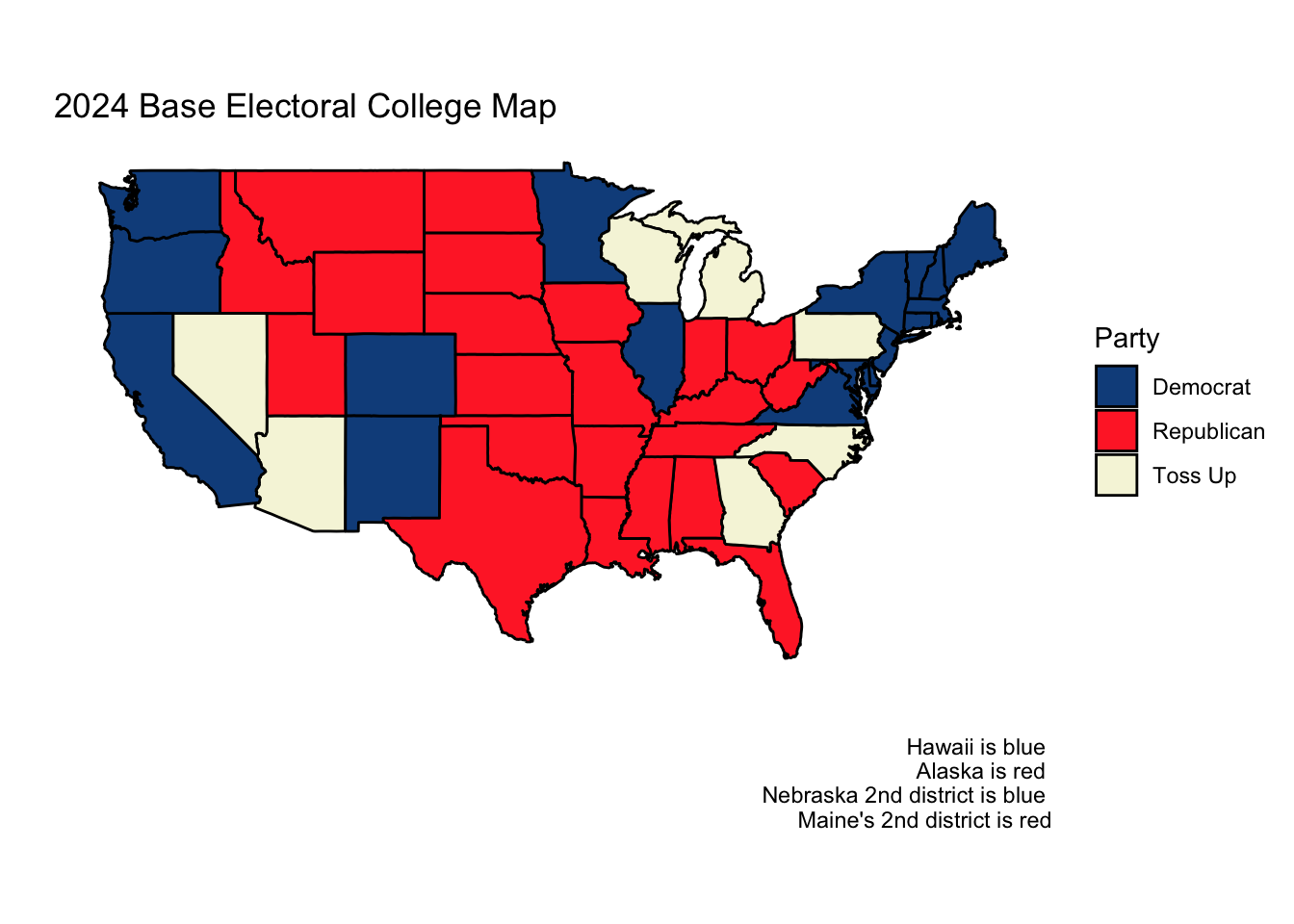
Both Sabato’s Crystal Ball of the Center for Politics and the Cook Political Report list the same seven states as “toss-ups.” These include the following:
- Arizona
- Georgia
- Michigan
- Nevada
- North Carolina
- Pennsylvania
- Wisconsin
While it is not inconceivable that other states/districts could unexpectedly flip (Florida, Ohio, Nebraska 2nd district, Virgina, Texas, etc), it is unlikely that one of these states/districts would ‘decide’ the election. If Florida were to go blue, for example, other more competitive states would have likely gone blue as well, clinching the election for Harris. While there exist realities where Texas or Florida or Ohio could be the tipping point of the presidential election, for the purposes of this week’s blog post, I will focus on the seven most commonly cited battleground states.
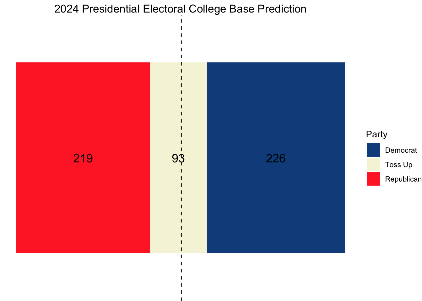
With this assumption in place, assuming other states and districts vote as they did in 2020, the base electoral map for 2024 looks as follows:


As we can see, this election cycle is incredibly competitive. 93 electoral votes reside in the seven toss-up states. Neither the Democrats nor the Republicans can claim a clear edge in the electoral college.
Preparing My Electoral College Model
Using state-level polling average data since 1980 from FiveThirtyEight and national economic data from the Federal Reserve Bank of St. Louis, I construct an elastic net model that uses the following fundamental and polling features:
- Latest polling average for the Republican candidate within a state
- Latest polling average for the Democratic candidate within a state
- Average polling average for the Republican candidate within a state
- Average polling average for the Democratic candidate within a state
- A lag of the previous election’s two-party vote share for the Democrats within a state
- A lag of the previous election’s two-party vote share for the Republicans within a state
- A lag of the election previous to last election’s two-party vote share for the Democrats within a state
- A lag of the election previous to last election’s two-party vote share for the Republicans within a state
- Whether a candidate was incumbent
- GDP growth in the second quarter of the election year
There are only 19 states for which we have polling averages for 2024. These 19 states include our 7 most competitive battleground states, a few other more competitive states, and a handful of non-competitive states (California, Montana, New York, Maryland, Missouri, etc.)
We will train a model using all of the state-level polling data that we have access to since 1980, and then test this data on our 19 states on which we have 2024 polling data. We can then evaluate how sensible the predictions are given what we know about each state.
| state | predicted_R_pv2p | predicted_D_pv2p | pred_winner |
|---|---|---|---|
| Arizona | 51.01580 | 48.97038 | R |
| California | 35.80677 | 64.21084 | D |
| Florida | 52.62952 | 47.35331 | R |
| Georgia | 50.85998 | 49.12645 | R |
| Maryland | 33.20191 | 66.82108 | D |
| Michigan | 49.19062 | 50.79956 | D |
| Minnesota | 46.97268 | 53.02218 | D |
| Missouri | 57.48452 | 42.48869 | R |
| Montana | 59.76029 | 40.20801 | R |
| Nevada | 49.64794 | 50.34117 | D |
| New Hampshire | 46.28916 | 53.70689 | D |
| New Mexico | 45.48921 | 54.50897 | D |
| North Carolina | 50.71703 | 49.26993 | R |
| Ohio | 55.28686 | 44.69062 | R |
| Pennsylvania | 49.92502 | 50.06351 | D |
| Texas | 53.82373 | 46.15672 | R |
| Virginia | 46.34602 | 53.65000 | D |
| Wisconsin | 49.46553 | 50.52409 | D |
| New York | 44.43304 | 55.56768 | D |
Here, we can see that, apart from Arizona, Pennsylvania, and Georgia, all of the 19 states on which we have data are projected to vote for the same party they did in 2020. This should give us some confidence in the accuracy of our model as it is in line with the historical behavior of the states.
I will now use a simulation to get an estimate of how confident we are in these results. I will do this by sampling new state-level polling measurements for each of our 19 states 10,000 times, assuming a normal distribution around the current polling values with a standarad deviation of two percentage points.
Doing so yields the following table.
| State | D Win Percentage |
|---|---|
| Arizona | 29.74 |
| California | 100.00 |
| Florida | 6.94 |
| Georgia | 33.20 |
| Maryland | 100.00 |
| Michigan | 74.75 |
| Minnesota | 97.69 |
| Missouri | 0.00 |
| Montana | 0.00 |
| Nevada | 63.17 |
| New Hampshire | 99.37 |
| New Mexico | 99.83 |
| New York | 99.92 |
| North Carolina | 41.66 |
| Ohio | 0.05 |
| Pennsylvania | 57.53 |
| Texas | 1.27 |
| Virginia | 99.01 |
| Wisconsin | 72.99 |
As we can see, the seven battleground states exhibit much more uncertainty than the other states. California, for example, does not vote red in a single simulation, and even Florida votes blue less than 7% of the time in our simulations. I will use the Democratic win percentages for the battleground states to estimate whether they will vote blue or red in 2024.
Projections
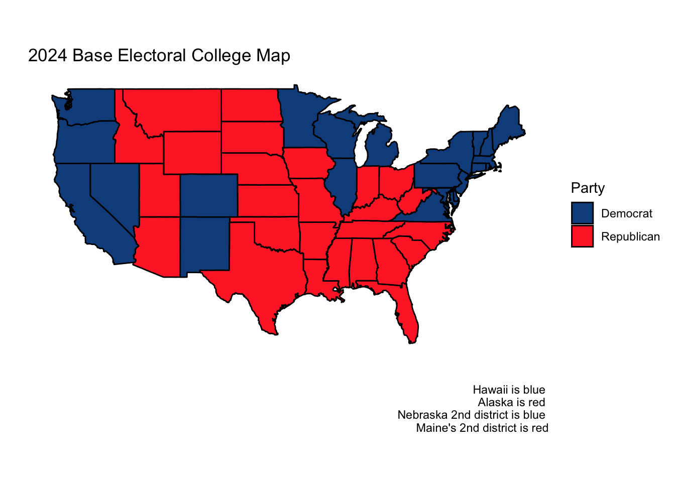
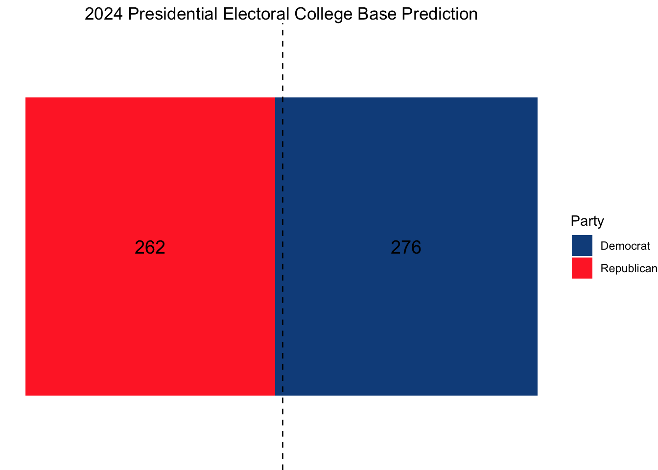
Using this model, our ultimate electoral college would look as follows, with Vice President Kamala Harris narrowly squeaking out a win.


If we also wanted to model the national popular vote, we could use what we did in Week 3, using an elastic net on both fundamental and polling data, weighting such that the polls closer to November matter more. This was Nate Silver’s approach.
Doing so, we find that the Democrats are projected to have a narrow lead in the two-party popular vote nationally (after scaling so that the estimates sum to 100%).
## Democrat two-party vote share: 50.86 %
## Republican two-party vote share: 49.14 %
Citations:
Kim, Seo-young Silvia, and Jan Zilinsky. 2021. “The Divided (But Not More Predictable) Electorate: A Machine Learning Analysis of Voting in American Presidential Elections.” APSA Preprints. doi: 10.33774/apsa-2021-45w3m-v2. This content is a preprint and has not been peer-reviewed.
Rosenstone, Steven J., and John Mark Hansen. Mobilization, Participation, and Democracy in America. Macmillan Pub. Co: Maxwell Macmillan Canada: Maxwell Macmillan International, 1993.
Shaw, Daron, and John Petrocik. The Turnout Myth: Voting Rates and Partisan Outcomes in American National Elections. 1st ed., Oxford University Press, 2020, https://doi.org/10.1093/oso/9780190089450.001.0001.
Wolfinger, Raymond E., and Steven J. Rosenstone. Who Votes? Yale University Press, 1980.
Data Sources:
Data are from the US presidential election popular vote results from 1948-2020, state-level polling data for 1980 onwards, and economic data from the St. Louis Fed.