Introduction
In this eighth blog post, in the second-to-last week before the 2024 election, I want to improve my election forecasts for the seven battleground states.
Over the past several weeks, we have explored OLS models, incumbency bias, the relationship between turnout and demographics, Bayesian approaches to predictions, and logistic regression, among other topics.
One thing that has consistently bothered me about the models I have constructed up to this point has been my fairly arbitrary standard deviation estimate when creating simulations. After using machine learning techniques to prepare a model to predict the two-party national vote share for each candidate within a state, I have run simulations assuming a normal deviation with a two-percentage point standard deviation to evaluate Harris and Trump’s chances of winning each state.
This approach has struck me as unsatisfactory, however, because surely we have more confidence in some states’ polling averages than others. For this reason, I am going to explore the reliability of polling data from each of our seven battleground states this week.
The code used to produce these visualizations is publicly available in my github repository and draws heavily from the section notes and sample code provided by the Gov 1347 Head Teaching Fellow, Matthew Dardet.
Analysis
The other day, I read an article by Nathaniel Rakich on ABC’s election site, FiveThirtyEight.com
In this article, Rakich calculates the “weighted-average error of general-election polls for president, U.S. Senate and governor conducted within 21 days of elections since 1998 in each state.” Seeing Rakich systematically assess the reliability of polls at the state level gave me the idea to adopt a similar method to estimate the variability of our two-party vote share predictions for each state.
Since standard deviation is roughly calculated by taking every value in a data set, calculating the mean of that data set, and then determining the average distance of each point away from that mean, I am curious if by calculating the average distance of the polls away from the true vote share we can get a better sense of standard deviation than the arbitrary 2 percentage points I had previously been using.
My Model
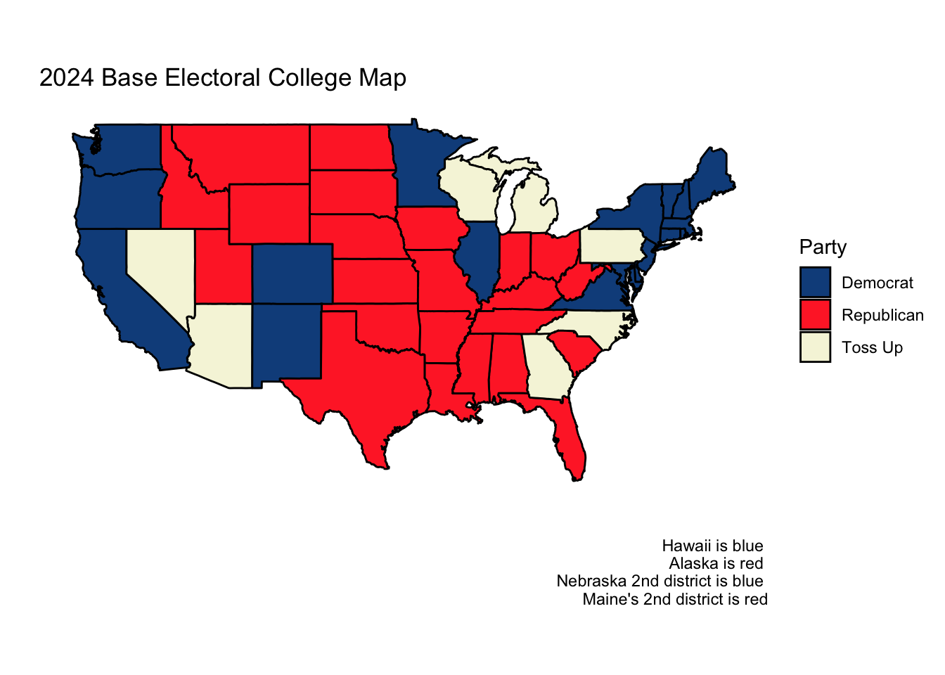
Both Sabato’s Crystal Ball of the Center for Politics and the Cook Political Report list the same seven states as “toss-ups.” Almost universally across news platforms and forecasting models, the following seven states are identified as the key swing states which will, most likely, determine the election
- Arizona
- Georgia
- Michigan
- Nevada
- North Carolina
- Pennsylvania
- Wisconsin
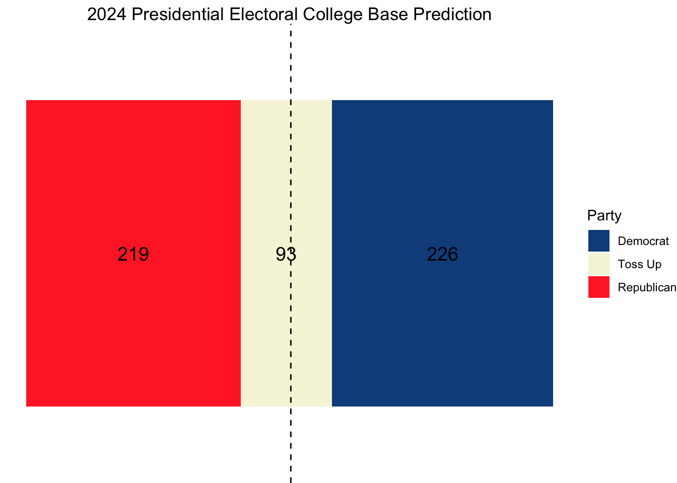
For the purposes of both this week’s model and the next week’s final prediction, I will forecast the two-party vote share in each of these battleground states and assume other states and districts vote as they did in 2020.
Preparing My Electoral College Model
Of the models I have created thus far, the elastic net, to me, seems to most fairly weigh the various covariates. For this reason, I will adapt much of my code from week five.
Using state-level polling average data since 1980 from FiveThirtyEight and national economic data from the Federal Reserve Bank of St. Louis, I will construct an elastic net model that uses the following polling features:
- Polling average for the Republican candidate within a state in the most recent week
- Polling average for the Democratic candidate within a state in the most recent week
- Polling average for the Republican candidate within a state in the last two months
- Polling average for the Democratic candidate within a state in the last two months
- A lag of the previous election’s two-party vote share for the Democrats within a state
- A lag of the previous election’s two-party vote share for the Republicans within a state
- A lag of the election previous to last election’s two-party vote share for the Democrats within a state
- A lag of the election previous to last election’s two-party vote share for the Republicans within a state
I am opting to only consider the polling averages within the last two months of the campaign rather than the entirety of the campaign as I believe these to be most predictive of the ultimate election outcome. I am concerned that introducing averages from earlier periods would lead to overfitting, and, considering the unique candidate swap of 2024, I do not believe Biden nor Harris’s polling averages from the stage in the election before Harris could establish a proper campaign strategy are informative. I will also be rescaling these mean polling averages so that they sum to 100 and can more readily be interpreted as two-party vote shares.
While there are a number of fundamental and economic covariates I considered exploring (Whether a candidate is only a party incumbent, GDP growth in the second quarter of the election year, RDPI growth in the second quarter of the election year, Unemployment rate in the second quarter of the election year, June Approval Rating, etc.), I found that my forecasts were highly variable depending on which fundamental variables I decided to include. It is my belief that many of the trends explained by fundamental variables (incumbency bias, high growth is good, high inflation is bad, etc.) is already baked into the polls, so I will focus on constructing a polls-only model for this week. Next week, however, I will include both a polls-only and a polls + fundamentals model.
We will train separate two-party vote share models for both the Republicans and Democrats in each of the swing states using data since 1980, and then apply this model to our 2024 data to generate predictions. To make this model, I am standardizing my features and regularizing them with elastic net linear regression.
Visualize Feature Importance
| state | predicted_R_pv2p | predicted_D_pv2p | pred_winner |
|---|---|---|---|
| Arizona | 50.99876 | 49.00276 | R |
| Georgia | 50.78078 | 49.22228 | R |
| Michigan | 49.75424 | 50.25202 | D |
| Nevada | 49.87381 | 50.13863 | D |
| North Carolina | 50.84669 | 49.15465 | R |
| Pennsylvania | 49.92205 | 50.08699 | D |
| Wisconsin | 49.98817 | 50.01462 | D |
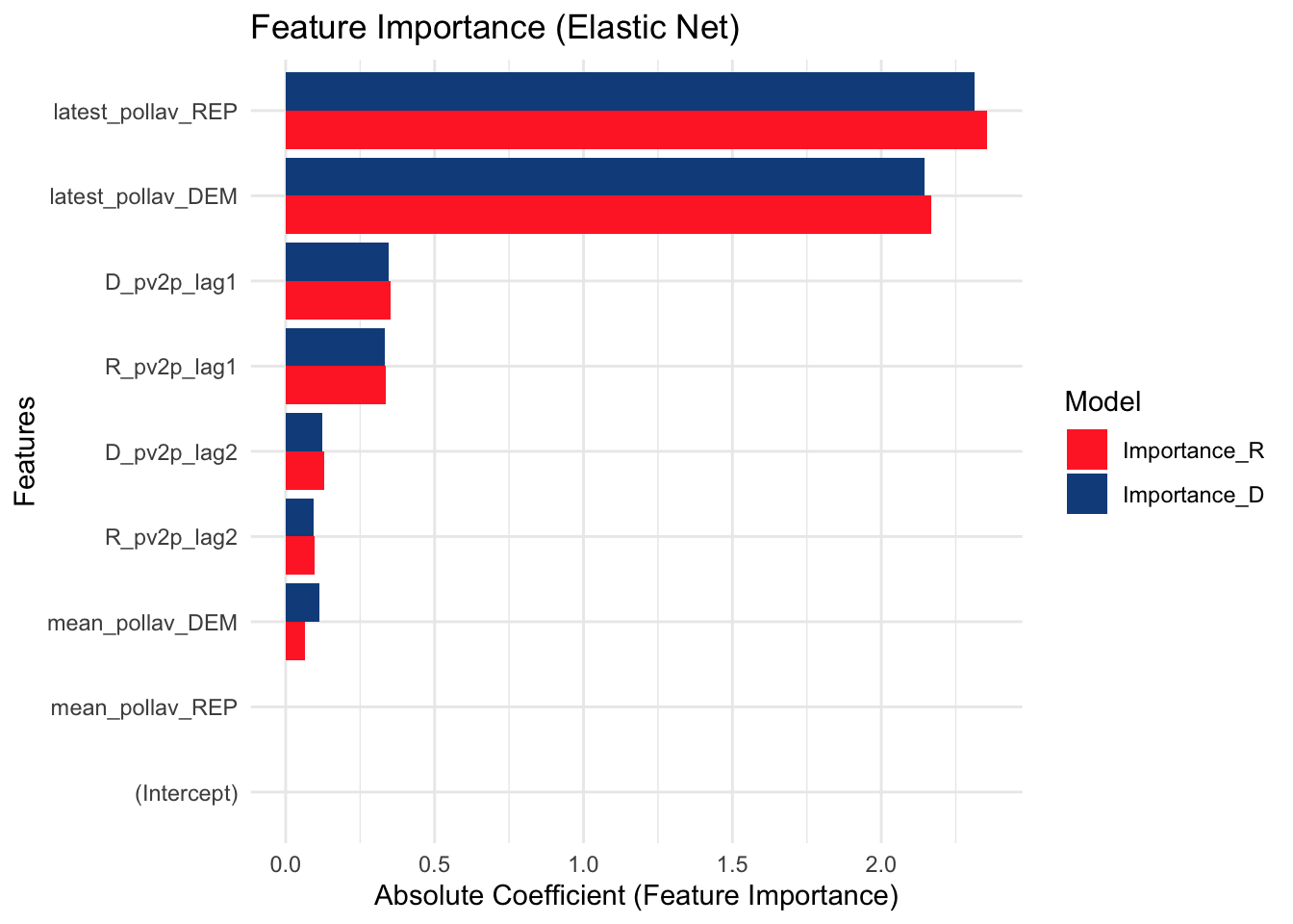
Here, we can see that Arizona, Georgia, and North Carolina are favored to vote red while the other states are favored to vote blue. In the feature importance graph, it is also clear that the latest week polling average is much more predictive than the two-month average.
I will now use a simulation to get an estimate of how confident we are in these results. I will do this by sampling new state-level polling measurements for each of our 7 states 10,000 times, assuming a normal distribution around the current polling values with a standard deviation determined by the average distance of each state’s poll away from the actual outcome.
To create this standard deviation, I will take the average of the mean polling error of each state in 2016 and 2020 (weighted equally for both years) to capture the “Trump-era” polling error.
| State | Weighted Error |
|---|---|
| Arizona | 0.7928877 |
| Georgia | 0.5363407 |
| Michigan | 2.3607260 |
| Nevada | 1.2531877 |
| North Carolina | 2.0568637 |
| Pennsylvania | 1.9538101 |
| Wisconsin | 3.6458086 |
Using the above weighted errors as standard deviations yields the following simulation breakdown.
| State | D Win Percentage |
|---|---|
| Arizona | 6.58 |
| Georgia | 7.53 |
| Michigan | 60.49 |
| Nevada | 61.16 |
| North Carolina | 35.92 |
| Pennsylvania | 59.55 |
| Wisconsin | 55.02 |
Projections
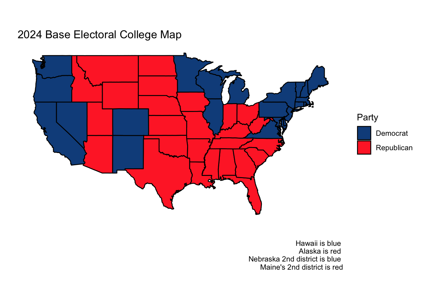
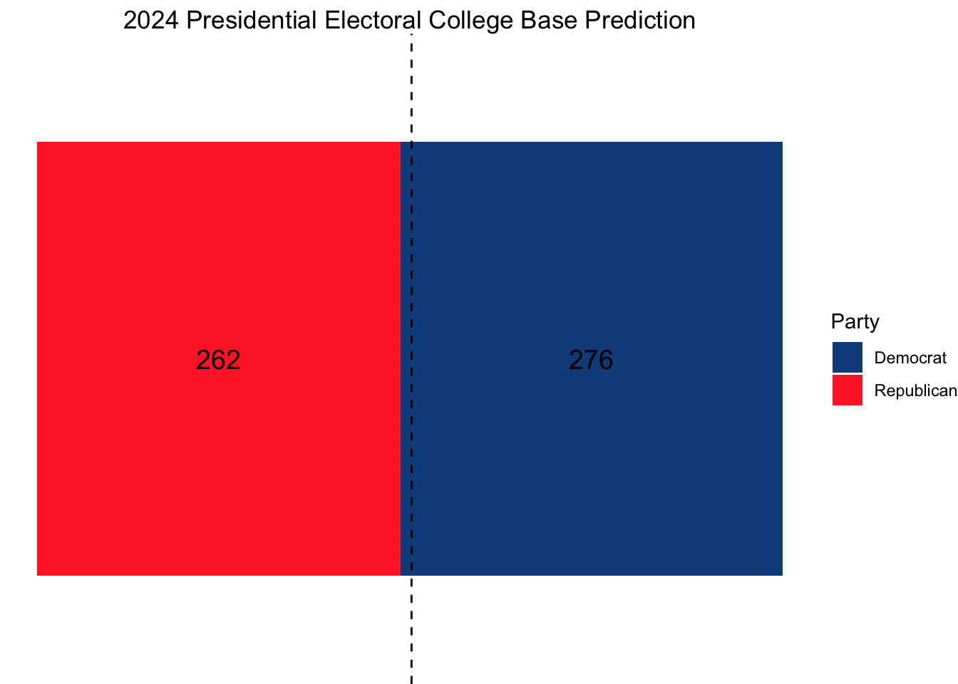
Using this model, our ultimate electoral college would look as follows, with Vice President Kamala Harris narrowly squeaking out a win.
Citations:
Rakich, Nathaniel. “Which States Have the Most — and Least — Accurate Polls?” ABC News, ABC News Network, 25 Oct. 2024, abcnews.go.com/538/states-accurate-polls/story?id=115108709.
Data Sources:
Data are from the US presidential election popular vote results from 1948-2020, state-level polling data for 1980 onwards, and economic data from the St. Louis Fed.